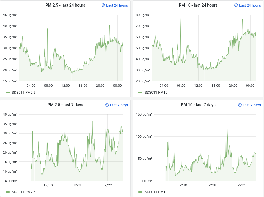
There are several graphs which use auto as value for Y-Min instead of 0 which means plotted data will be cut off at a higher value than 0 when no single measurement within the displayed timeframe is low enough.
This causes misleading representations when comparing multiple data series next to each other or the same data series with different timeframes, as shown in the examples below:
@eliasp This could be configured. But I’m sure that some other users would like to have it the way it is But I think this is a problem for all projects with so many users …
We are a volunteered project with only limited time to administer all the tools we provide for the users. And for the graphs we used nearly the same config for the graphs over all types of sensors. So we can copy easier any changes we need to make in the case of errors, problems or software updates.
The other graphs need some more flexibility on the y-axis (neg. temperatures, offset of nearly 900 hPa for pressure).
Thanks for the reply - I appreciate that and fully understand why you’re hesitant making those configuration changes.
I blindly assumed you’re using some kind of configuration management solution to manage your dashboard YAMLs where you inherit a default configuration per dashboard and only apply customizations where needed.
I was planning to set up a personal Grafana instance for some other use cases of mine anyways, so I’ll make use of data exports and then push my sensors’ data to my personal timeseries DB as well.
 But I think this is a problem for all projects with so many users …