We are trying to create a network of air-pollution sensors in Greece that also sends data to sensor.community. We have built the sensors, and now it’s time to create a visual-representation project. This way, you can have the sensor, for example, on your balcony, but still see exactly what is happening inside your living room.
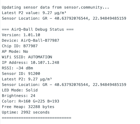
We used a Wemos D1 Mini and a WS2812B LED Ring (7 LEDs)
I think it’s a great idea to work on visualization of air quality. Visualisation with a color gives an immediate non-technical indication of what is going on.
With respect to the colours, there is so much choice of what concentration you associate with what colour. One of the ranges used in the netherlands avoids the use of the color green, because that would suggest there is a good or ‘harmless’ level of PM: Luchtmeetnet.nl
The WHO has its own (slightly more strict I think) than our national ranges.
Well, your code (I think I need to use the .ino file) does not compile right away. I think you should change the D4 to GPIO2 (=2 in the code), so it can be compiled right away.