Hello,
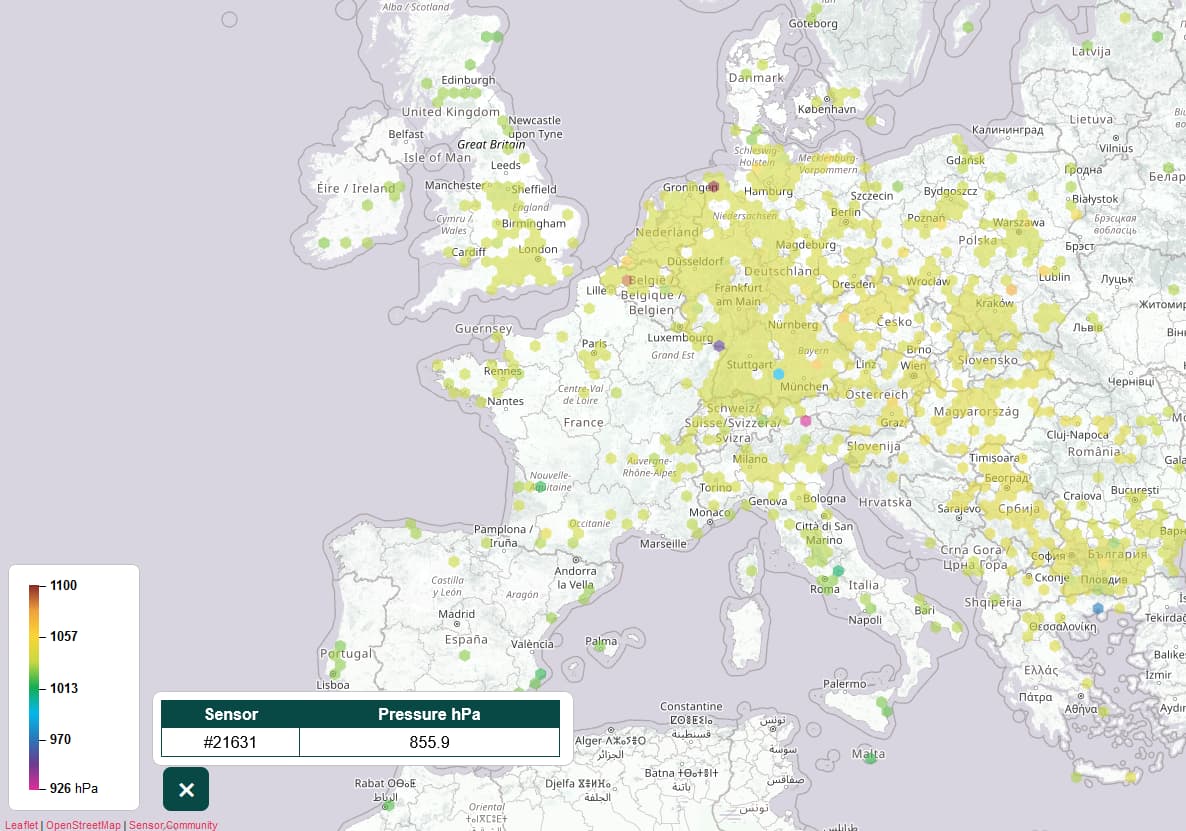
I have noticed that the pressure map gets useless by few rogue sensors which report record-hurricane level of pressures. The coloring autoscaling is totaly thrown off by these outliers. Would it be possible to have them removed for the purpose of color-axis assignment? (or have the colors hardcoded for given pressures)
Example:
Welcome!
I don’t completely understand what you mean. You want to exclude those “rogue sensors” ?
If you zoom in, you can detect the out of range values.
There are hard limits (upper is 1100 hPa, lower is 926 hPa). Otherwise the lowest value of the scale in your screenshot would be minimum 856 hPa.
You are right about limits already being in there, sorry I didnt notice… I would say they are maybe still too generous?
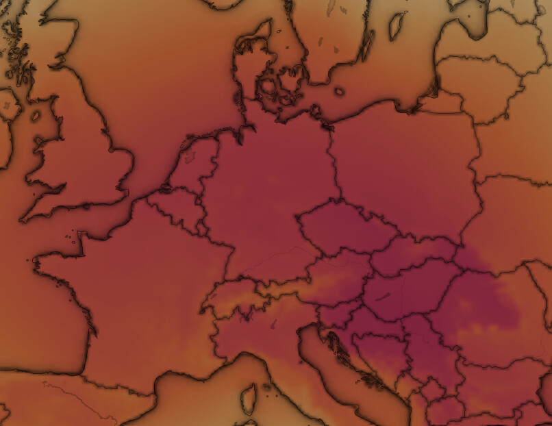
For example I cannot discern any difference between Hungary, Czechia and Benelux based on the color scale here. Compare it to windy
Too much of the colour scale “bandwith” wasted for values which happen quite rarely.